THIS BRAND IS MY LIFE
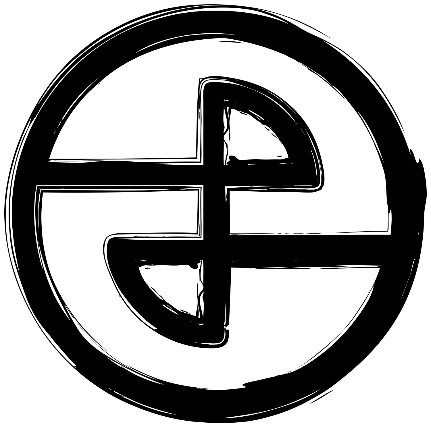
BEHIND THE circle LOGO
i drew up The original circle logo with pencil on some scratch paper and was taken digital. My goal was to create an iconic logo that represented the concepts of perpetual change, continuity, strength, and peace. i wanted something that to me represented the full gamut, all aspects of life.
The logo incorporates all numbers 1 through 10, which add up to 55. 55 in numerology stands for perpetual change and trust. It also incorporates the G from Gamut and the lower case f for fitness, as well as my initials, pf. Here is one of my first brainstorm designs i ever drew up that never made it to print, incorporating the 55 concept:
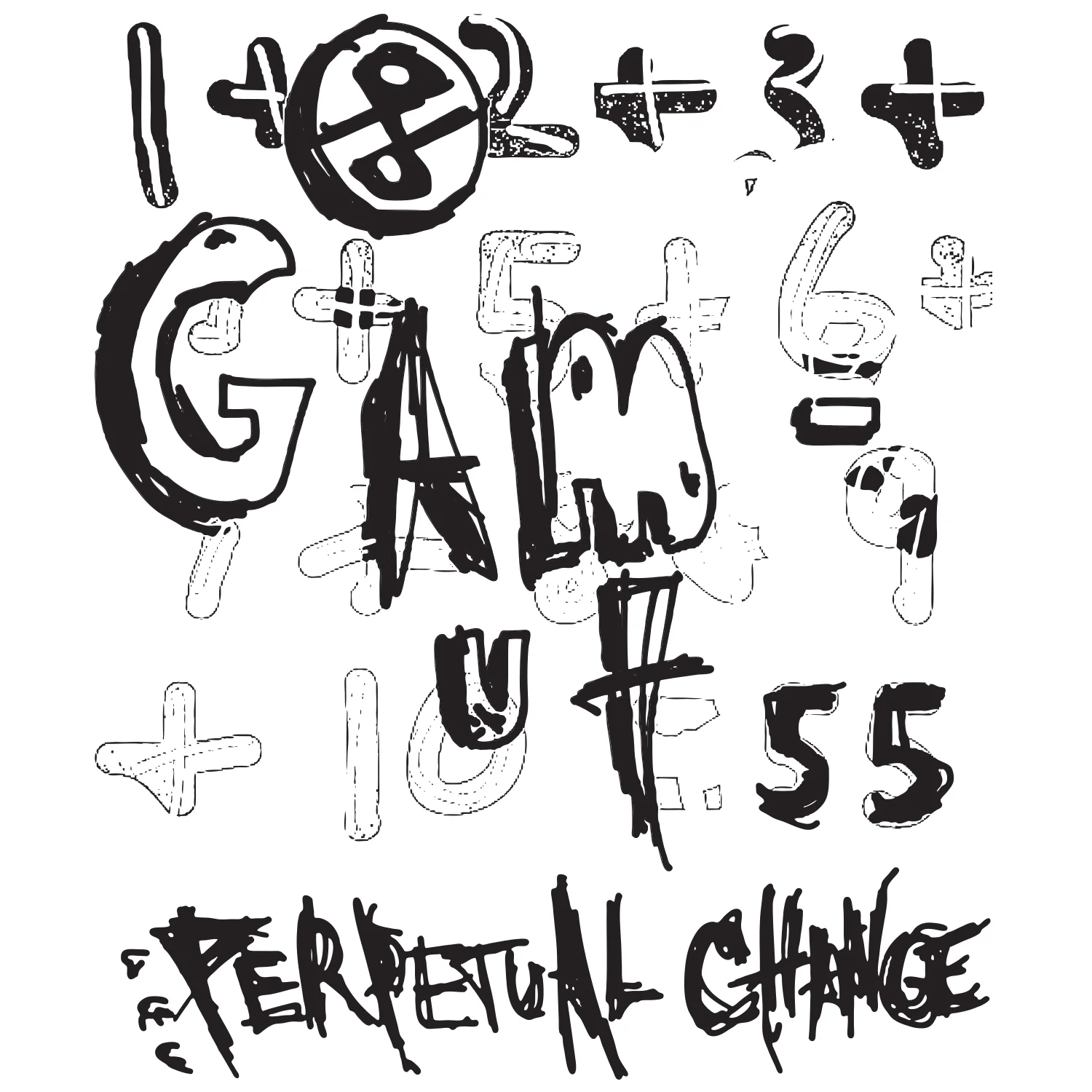
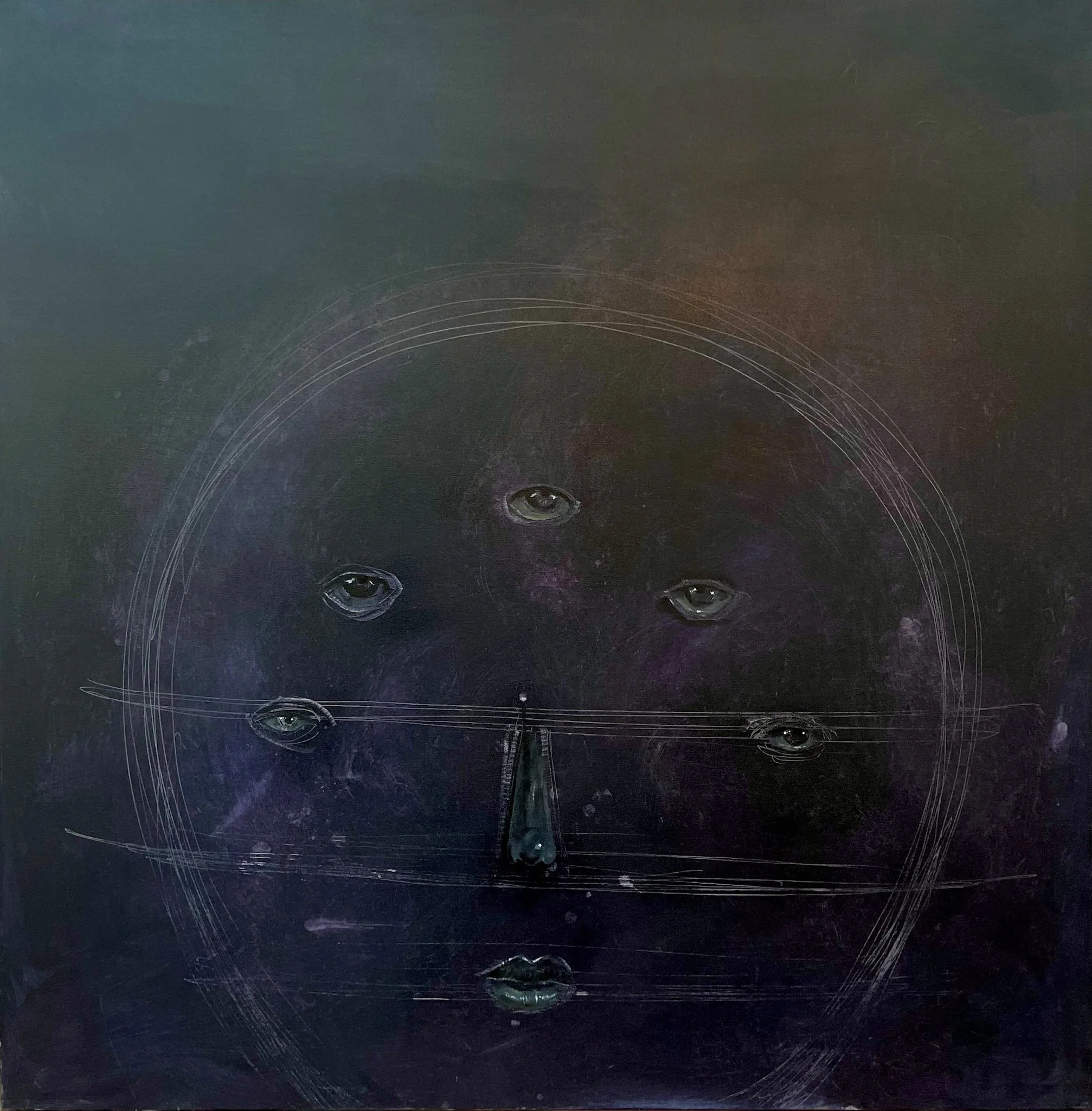
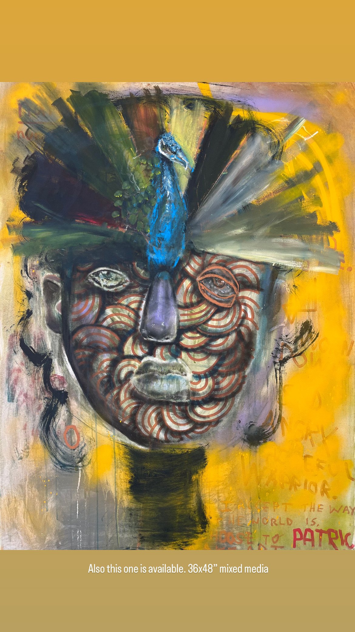
This one is about tapping into your higher self and optimizing your chakra system by being a fucking warrior. Specifically by letting go of addictions, standing up to bullies in your life(including yourself), and not letting your voice and creativity be stifled. This one is a big one 38×72”